All Articles
Japanese Artist Creates London's City of Music Conference Logo as Part of UNESCO Exchange
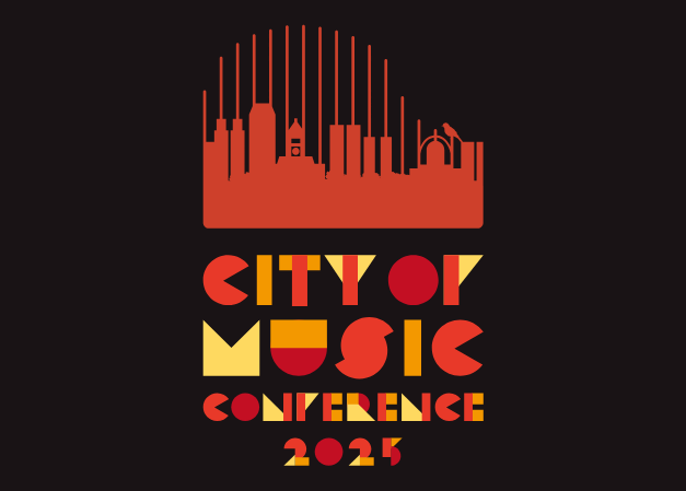
The London Music Office is delighted to announce a UNESCO project amongst London, Canada’s UNESCO City of Music and Asahikawa, Japan, UNESCO City of Design. The exchange project is an outcome of the 2024 annual UNESCO Creative Cities meeting in Braga, where the Sharing Cities Initiative was instigated to promote cross creative work. Through this project, Asahikawa was asked to collect submissions from local designers to create a logo for London’s 2025 City of Music Conference, taking place November 6 & 7, 2025. The chosen design was created by local graphic designer, Kaoru Ueda.
About the Author
Kaoru Ueda – Local Vitalization Cooperator / Cope to Design

Born in Hyogo Prefecture, Kaoru worked as a veterinary nurse before switching careers to become a graphic designer. She began her design career at a cosmetics company, gaining experience in both design and product development before taking on responsibilities in business strategy and project management, overseeing the business as a whole and driving brand growth and market expansion. In November 2023, she joined the Local Vitalization Cooperator program and moved from Osaka to Asahikawa, where she now runs the Design Gallery and promotes local design initiatives. Through social media management and event planning, she highlights the region’s strengths and shares them with others. She also works on product development using locally sourced materials and creates designs under her freelance brand, Cope to Design. Kaoru Ueda’s brand name was inspired by her former pet dog, Cocopel. By combining the syllables ‘co’ and ‘pe’ from the dog’s name and adding the word ‘to’ (meaning ‘and’ in Japanese), she created Cope to Design (pronounce “ko-peh-toe-design”), meaning “Cope and Design” in Japanese.
About the Design
“This design was created as a symbol of international exchange, where music, design, and nature resonate together. The symbol depicts the silhouette of the cityscape of London, Canada as the keys of a grand piano, expressing the city’s identity as a City of Music. At the edge of the symbol, a small bird – symbolizing rich nature – has been placed as a subtle “hidden touch”. This playful element is intended to bring a smile to those who notice it. As for the font, I drew inspiration from the basic shapes of ○, △, and □, which are used in Asahikawa’s “Kids Design Project”, one of our initiatives as a City of Design. By incorporating these geometric forms into the lettering, the design also incorporates an element of Asahikawa’s identity as a City of Design.” – Kaoru Ueda
-

LONDON MUSIC CENSUS AN OVERVIEW: TIP OF THE ICEBERG
The London Music Office embarked on its initial journey to understand…
Read Full Article